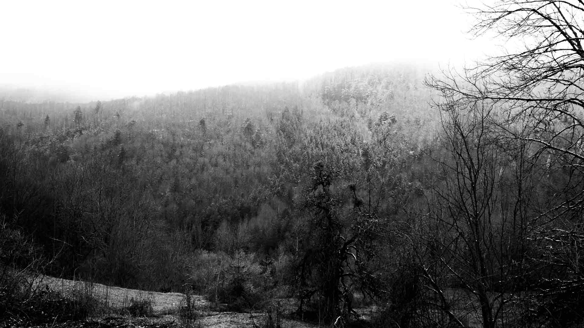
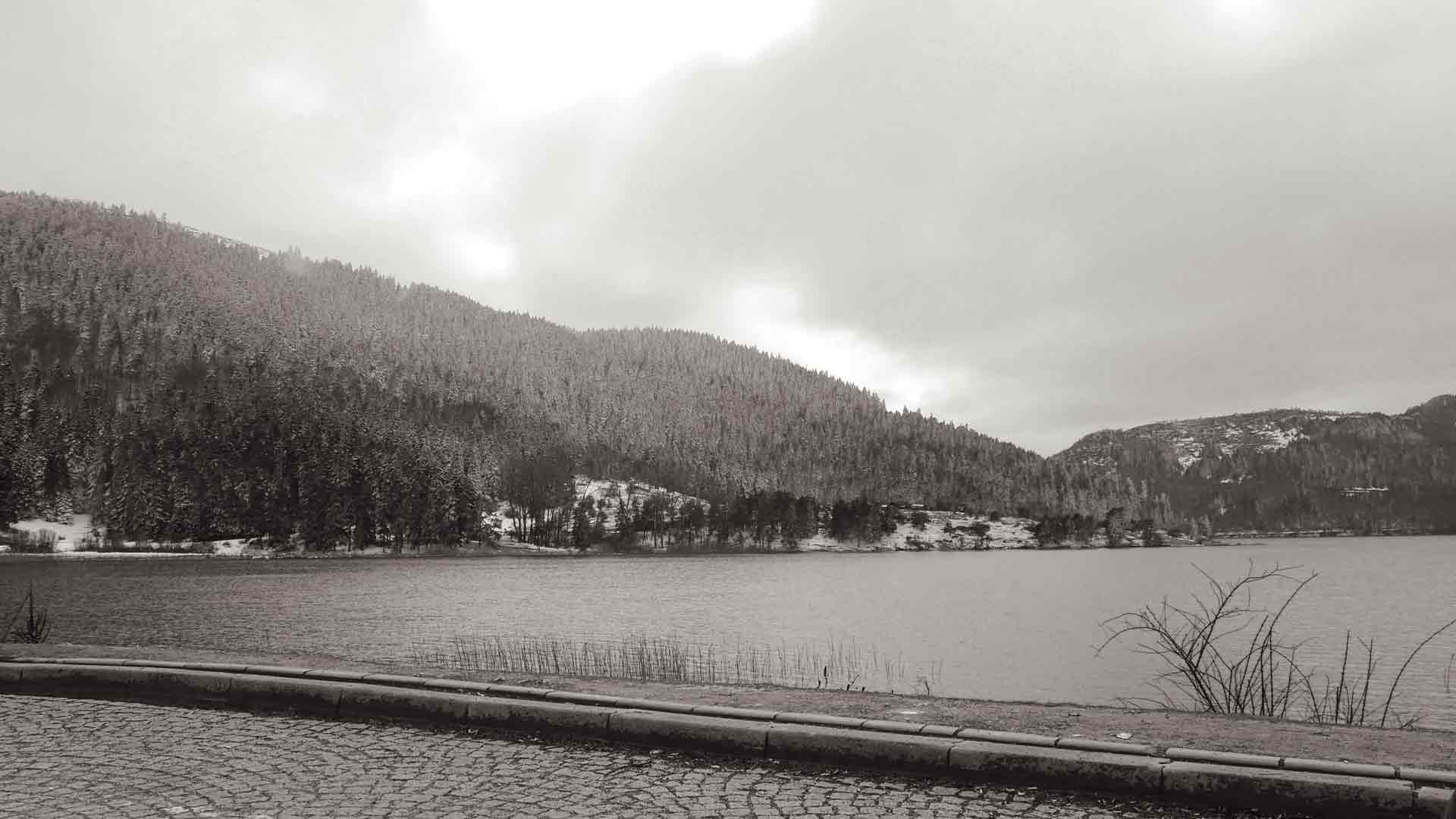
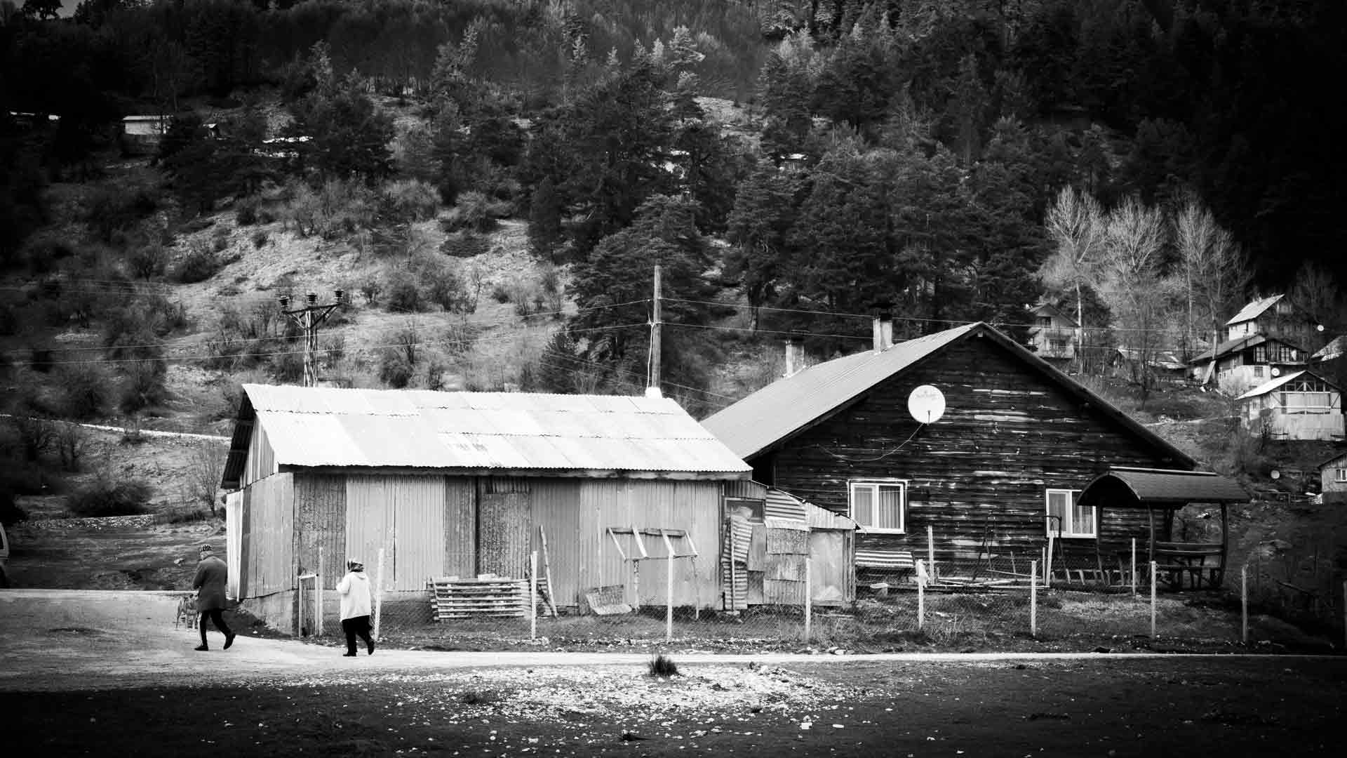
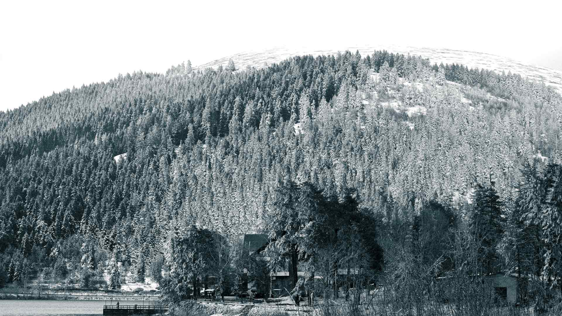
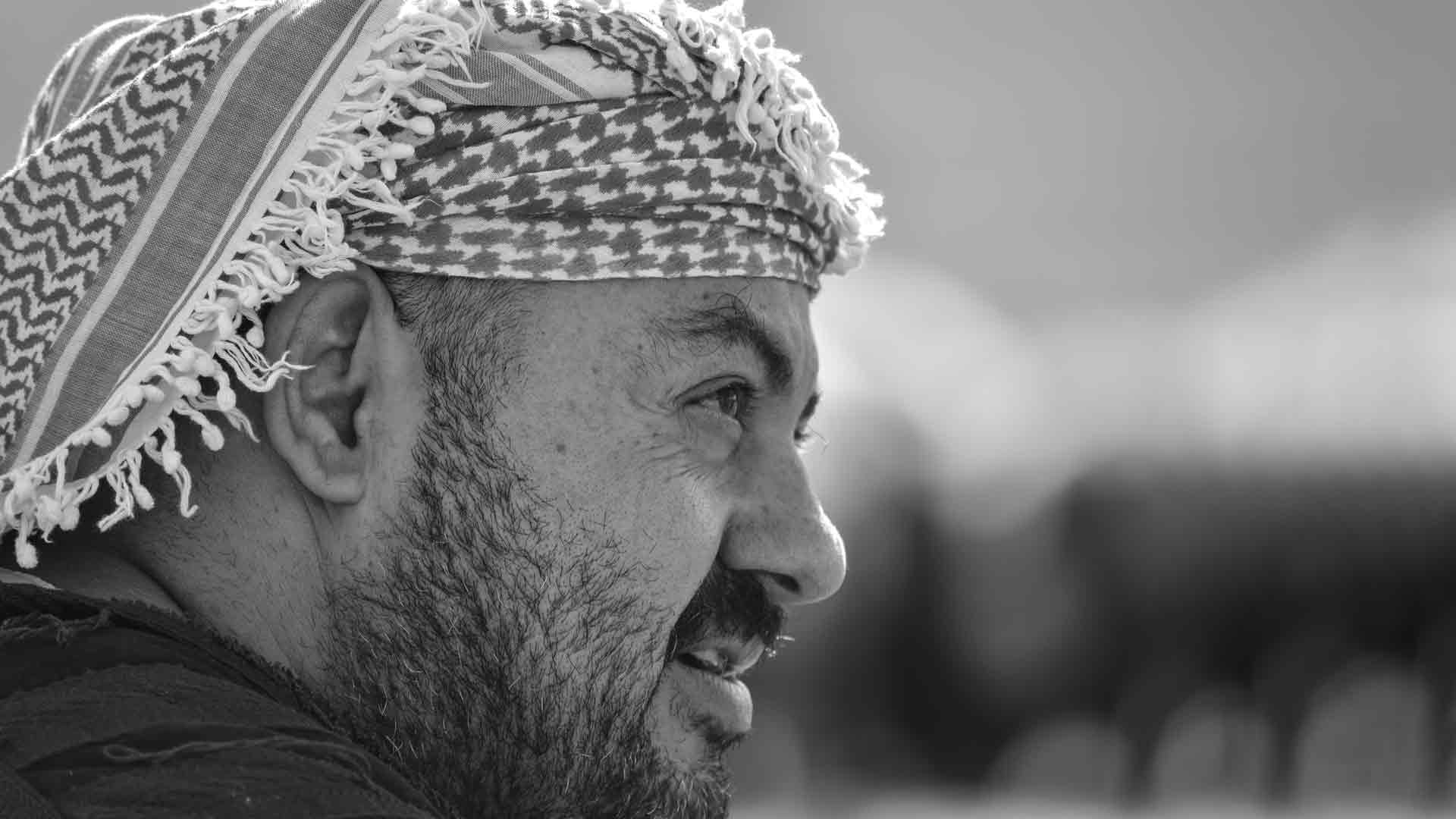
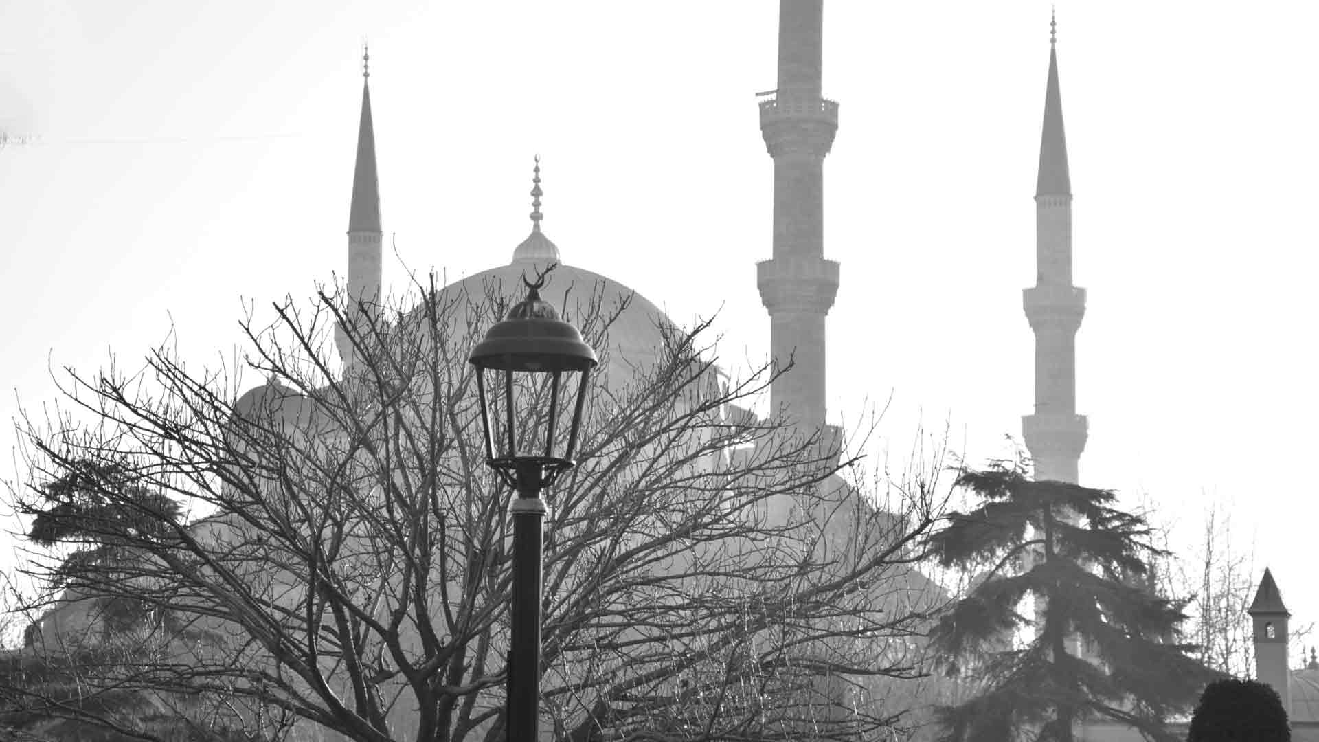
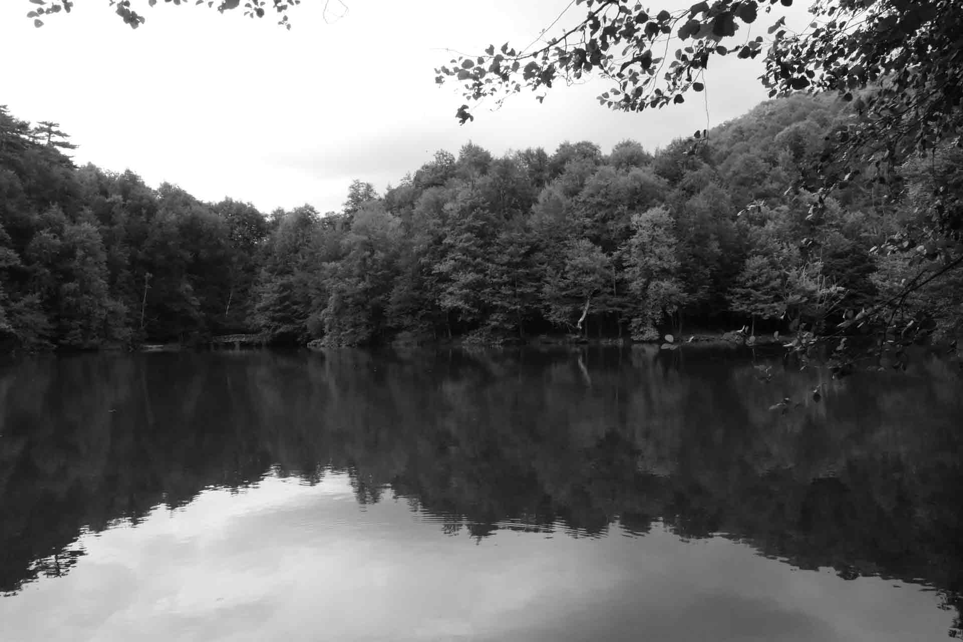

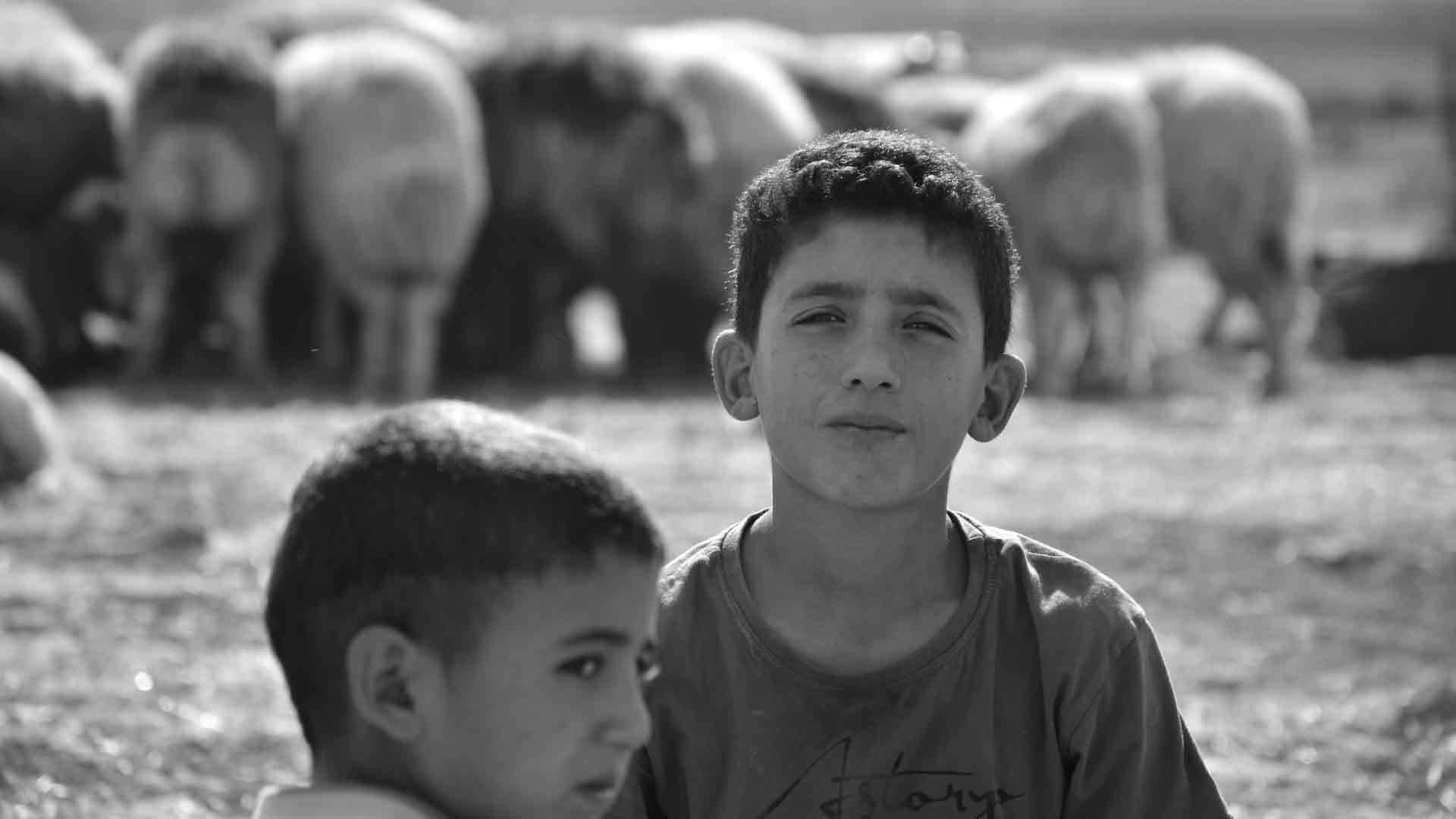

In the captivating realm of black and white photography, the magic often happens not just when you press the shutter, but also in the quiet alchemy of post-processing. Converting a vibrant color image into a compelling monochrome masterpiece is far from a one-click wonder. It’s an art form in itself, requiring a discerning eye and a mastery of digital tools. For photographers in Turkey and the Middle East, a region overflowing with stunning landscapes, intricate architecture, and expressive faces, understanding these best practices in post-processing is crucial for creating images that truly resonate and achieve strong SEO in searches like “black and white conversion techniques,” “monochrome editing tips,” or “Lightroom Photoshop B&W.”
So, you’ve captured a fantastic color image, focusing on light, texture, and composition. Now, how do you transform it into a powerful black and white statement? Let’s explore the best practices for converting to monochrome in post-processing.
1. Always Shoot in RAW (and Why it Matters for B&W)
This is the golden rule of post-processing, especially for black and white.
- Maximum Data: RAW files contain significantly more tonal information and dynamic range than JPEGs. This is paramount for black and white, as it gives you immense flexibility to recover detail in shadows and highlights, and to manipulate individual color channels for precise tonal control without introducing banding or artifacts.
- Non-Destructive Editing: RAW files are like digital negatives; your edits are applied as instructions rather than permanently altering the original image data. This means you can always go back and make changes without degrading the image quality.
- In-Camera B&W Mode vs. Post-Processing: While your camera might have a monochrome mode, it typically applies a JPEG conversion. It’s better to shoot in color RAW and visualize in black and white (if your camera has an electronic viewfinder, setting it to monochrome preview is excellent) and then perform the conversion in post-processing. This way, you retain all the color information for maximum flexibility.
2. Choose Your Conversion Method Wisely: Beyond Desaturation
Simply desaturating an image (pulling the saturation slider to -100) is the simplest, but often the weakest, way to convert to black and white. It flattens tones and offers little control. Instead, opt for methods that give you power over individual color channels:
- Black & White Adjustment Layer (Photoshop) / B&W Panel (Lightroom): This is the industry standard. These tools provide individual sliders for Red, Orange, Yellow, Green, Cyan, Blue, and Magenta. By adjusting these sliders, you control how each original color contributes to the grayscale tones.
- Example: To darken a blue sky and make clouds pop, drag the “Blue” slider to the left. To brighten green foliage, drag the “Green” slider to the right. This allows for selective contrast and tonal separation that simple desaturation cannot achieve.
- Channel Mixer (Photoshop): A more advanced tool that allows you to specify the percentage contribution of the Red, Green, and Blue channels to the overall grayscale output. It offers granular control but can be less intuitive than the B&W Adjustment Layer for beginners.
- Presets (Starting Point, Not Final): Many software programs offer black and white presets (e.g., “High Contrast,” “Infrared,” “Neutral”). These can be excellent starting points to quickly see different looks, but always use them as a foundation for further manual adjustments.
3. Master Tonal Control: Levels and Curves are Your Best Friends
Once converted to black and white, refining the tonal range is crucial for dramatic impact.
- Levels: This tool allows you to set your black point (the darkest tone in the image) and white point (the brightest tone). By bringing the black slider inwards, you deepen shadows; by bringing the white slider inwards, you brighten highlights. This expands the overall tonal range, adding punch.
- Curves: The most powerful tool for granular tonal control.
- Global Contrast (S-Curve): The classic “S-curve” adjustment boosts global contrast by darkening shadows and brightening highlights.
- Selective Tonal Adjustment: You can add multiple points to the curve to selectively brighten or darken specific tonal ranges (e.g., brightening mid-grays without affecting blacks or whites). This allows for sophisticated dodging and burning effects across the entire image.
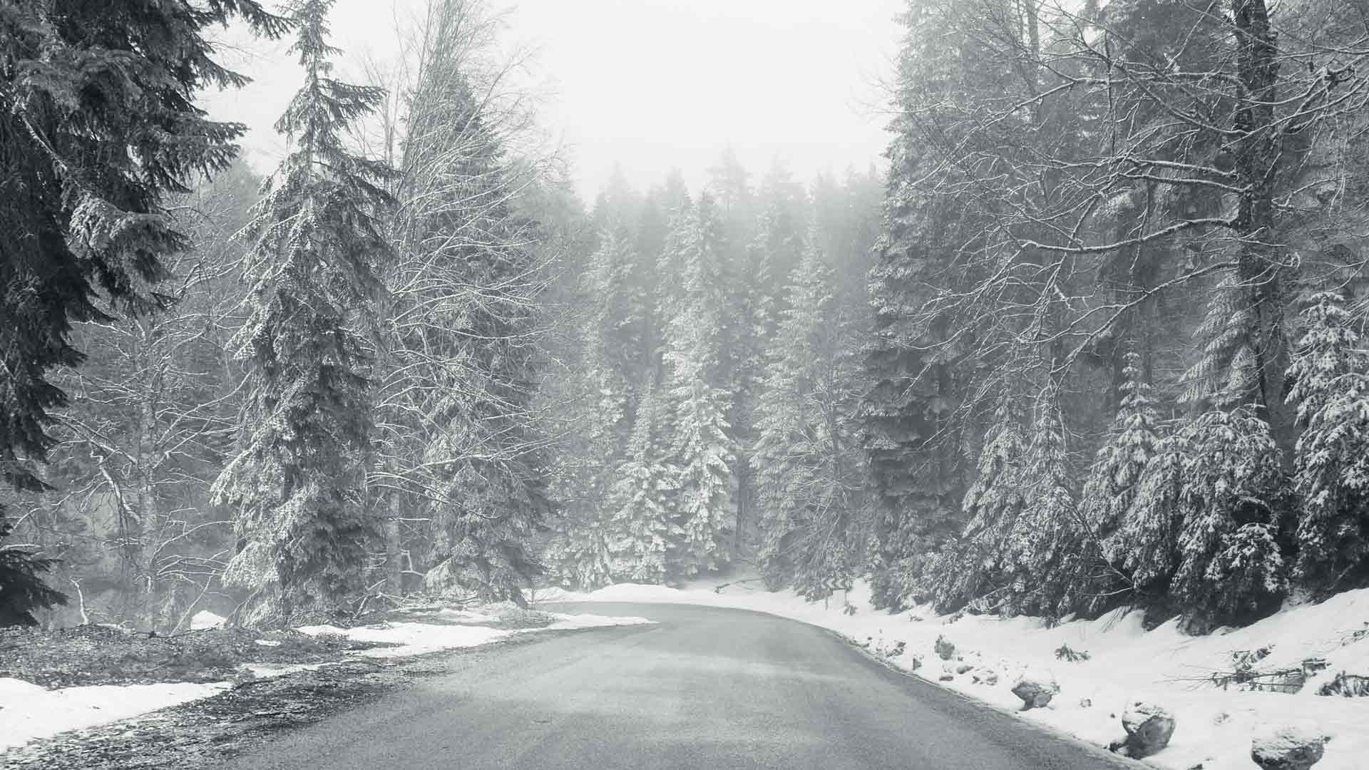
4. Enhance Local Contrast, Texture, and Detail
This is where you bring out the tactile qualities and intricate elements, particularly important for the rich textures found in Turkey and the Middle East.
- Clarity Slider (Lightroom/ACR) / Mid-tone Contrast (Photoshop): This slider increases contrast specifically in the mid-tones, making objects appear sharper and more defined. It’s excellent for emphasizing texture on stone, fabric, or weathered surfaces. Use it carefully, as overdoing it can create halos or a gritty, artificial look.
- Texture Slider (Lightroom/ACR): A more refined tool than Clarity, the Texture slider enhances or softens fine details without affecting overall contrast as much. It’s superb for bringing out subtle surface irregularities.
- Sharpening: Apply sharpening after all other adjustments to enhance edge definition. Be mindful not to over-sharpen, as it can introduce noise or artifacts, especially in areas of smooth tone.
- Dehaze: Originally designed to remove atmospheric haze, the Dehaze slider can also be a powerful tool for adding contrast and depth, particularly to skies or distant elements.
5. Dodging and Burning: Painting with Light
These classic darkroom techniques are invaluable for selective tonal control and guiding the viewer’s eye.
- Dodging (Lightening): Selectively brighten areas to draw attention, lift shadows, or reveal hidden details. Think of brightening a face in a portrait or illuminating a specific architectural detail.
- Burning (Darkening): Selectively darken areas to deepen shadows, add drama, or subdue distracting elements. This is excellent for darkening skies, enhancing leading lines created by shadows, or adding intensity to a scene.
- Implementation: Use adjustment brushes or luminosity masks in Photoshop/Lightroom for precise control.
6. Vignetting: Subtle Focus and Mood
A subtle vignette can draw the viewer’s eye towards the center of the frame and enhance the overall mood.
- Dark Vignette: Often used to deepen shadows around the edges, creating a sense of focus and drama. This can be particularly effective for portraits or landscapes where you want to emphasize a central element.
- Light Vignette (Reverse Vignette): Less common, but can be used to lighten edges, creating an ethereal or dreamlike quality.
7. Consider Adding Grain (Carefully)
For a classic, film-like aesthetic, adding a touch of artificial grain can enhance the tactile feel of your black and white images.
- Subtlety is Key: Use grain sparingly. Too much can make the image look noisy or distracting.
- Purposeful: Consider whether grain truly enhances the mood or style you’re aiming for. It works well for gritty street photography or nostalgic scenes.
8. Final Touches: Cropping and Spot Removal
- Crop for Impact: Re-evaluate your composition in black and white. Sometimes, a slightly different crop can drastically improve the image when color is removed. Focus on strong lines, shapes, and negative space.
- Clean Up Distractions: In black and white, small dust spots, sensor dirt, or distracting elements become much more noticeable. Use the spot removal tool to meticulously clean up your image.
SEO Benefits: Converting for Discoverability
Implementing these post-processing best practices not only leads to superior black and white images but also boosts your SEO for the Turkish and Middle Eastern audience:
- High-Quality Visuals: Search engines prioritize high-quality, engaging content. Well-processed black and white images are more likely to be shared, linked to, and viewed for longer, signaling relevance.
- Specific Keyword Targeting: When writing about your process, use long-tail keywords relevant to post-processing, such as “Lightroom black and white conversion tutorial,” “Photoshop B&W contrast enhancement,” or “best practices for monochrome editing.”
- Educational Value: Providing detailed tutorials and tips positions your blog as a valuable resource for photographers in the region looking to improve their skills.
Conclusion
Converting to black and white is a crucial step in the monochrome creative process, transforming a mere desaturation into a powerful artistic statement. By understanding and meticulously applying best practices in post-processing – from shooting in RAW and choosing the right conversion method to mastering tonal control, enhancing textures, and selectively adjusting light – you gain unparalleled control over your final image. For photographers showcasing the profound beauty of Turkey and the Middle East, this mastery of the digital darkroom is essential for creating timeless, impactful black and white photographs that not only captivate your audience but also significantly elevate your online presence. So, embrace the sliders, refine your tones, and let your monochrome visions truly shine.